

 Sometimes the only thing between you and digital action is a click, but you don’t know where to click.
I was recently visiting a client site and realized I couldn’t figure out how to take action on the site. I wanted to give, to support, to share, but after 20 min of digging around I couldn’t figure out how to do any of those things. I couldn’t take action.
The average visitor looks for 8 seconds before giving up.
Designers borrow the term “affordance” from psychology to describe human-object interaction. Affordance is a perceived signal or clue that an object can perform a certain action. For example, a chair is around knee-high to afford sitting. A toothbrush is a little longer than the human palm to afford gripping.
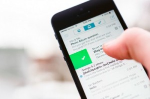
Unlike physical objects which gain affordance from their size, shape and weight – web and mobile interfaces gain affordance through design. Have you ever thought about how easy or hard it is for visitors to take action on your website. The more affordance you design into digital actions, the more intuitive it is for people to take action.
Here are a few best practice affordances for a website:
- Social Media buttons in the top right corner. Don’t make people scroll to the bottom of the screen to follow you.
- A visible button for giving. Not a tab that requires searching after.
- An invitation to join an email list using first name and email only. Don’t ask for name, rank and serial number.
- Something free! Offer a free resource in exchange for an email. Make the exchange quick and painless but valuable.
- Ask! If a visitor only comes once to your site, what do you want them to do? Comment? Give? Sign-up? Make sure and ask.
Capitalize on that 8 seconds by designing as much affordance as possible into the actions on your website.